
How To Share Your Work Effectively
How you say something is more important than what you say

Introduction
In the modern world the abundance of content is almost incomprehensible. We all have a sense of this in our day to day lives with the entertainment industry producing thousands of podcasts, books/audiobooks, TV shows, movies, games, and songs. All of this content, amongst others, compete for our free time and attention. Because of this vast content available, no matter how hard we try or how much of our personal lives we sacrifice, we will never be able to consume all of the entertainment we wish we could. As a result, we are left only consuming material that is high on our priority list. The situation is exacerbated by spending excessive time on social media apps; an outcome which is engineered by said platforms. This is due to the fact that the companies profit by retaining users’ attention for as long as possible. In the process, it negatively impacts our productivity by decreasing attention span and wastes our ever more precious time. Thus, our time and attention is an ever increasingly precious resource that is competed for by more and more things.
This experience is directly applicable to our professional life in ways that people don’t often spend much time thinking about. In fact, the situation for research may be even more dire due to the fact that although podcasts, audiobooks or TV shows can often be played in the background with minimal attention, research requires high amounts of concentration and focus to understand. Analogously, in the modern academic world there are hundreds of reputable journals which each publish large volumes of research papers every single week. Likewise, when at conferences there are often large numbers of posters and presentations to enjoy. Unfortunately, we are not capable of giving our full attention to every paper or presentation as humans have limited amounts of ‘mental energy’ and there are only so many hours in a day. These situations require us to prioritise what we think are the most relevant and important studies in order to make the best use of our time and energy. The vast majority of the time, studies which pique our interest are those that have a direct link to our topic of interest and presented in a clear and logical fashion. Moreover, if the data presented looks confusing, or is poorly presented, a lot of the audience will lose interest. Given this, it is crucial that we make sure our own research is easily understandable and presented in an attractive way that allows people to effortlessly see the value in our work.
We hope this post can provide a strong foundation for effective science communication.
Clear Communication is Crucial
As stated above, communicating and presenting your research effectively is arguably the most important aspect of any project. This is because research papers, presentations (whether it be in the form of a talk or poster), and grant applications all depend on communicating your research and hypotheses well enough for the audience to understand and appreciate. In some sense, findings are only useful if they can be understood by others. Furthermore, it is important to remember that you are competing with others for opportunities, such as funding and academic positions, and the chances of your success has a lot to do with how others perceive the impact of your work. Therefore, it is crucial to your career that you are able to communicate your research effectively.
To do this, we should understand how to communicate in the following formats:
Audio
Visual
Writing
Orientation by Objective
Defining the aims and objectives of a study is vital to communicating in all mediums. This is because it allows the audience to understand the goal you are trying to achieve and provides the context for the information you are presenting. Without this, the audience will feel as if they are being barraged by seemingly disconnected facts. Humans cannot remember a lot of new information at once, and placing information in a context can lighten this burden; as they will likely have an intuition about which details are important for them to remember the specific details of, and which are just background. For example, for a project that performs wet lab experiments in vitro, the disease statistics etc. are important to the context and can show the motivation behind the research and not necessarily needed to be memorised by the audience during a talk. However, if the project focuses on epidemiology, the statistics are likely to be a lot more relevant and require your attention.
In line with this, you should minimise information dumps, particularly in presentations. Without sufficient context, the audience will either waste energy trying to give it context themselves, which runs the risk of being incorrect, or they will feel lost and/or disinterested. In either case, they will not be giving their full attention to the novel findings that you are attempting to share in their appropriate context. Therefore, it is crucial that you clearly outline the gap in the knowledge and why it’s important it is filled in the introduction. Additionally, you should clearly state if your study is sufficient to fill the gap and how/why this is the case. One final point to remember is that you should periodically remind the audience of the most relevant information when presenting key findings so that they can understand the implications of your findings. By fulfilling these criteria you will make sure that the audience remembers the most relevant information to your study and doesn’t feel lost.

Engage The Audience
Engaging the audience is an extremely high priority component that is heavily tied into the section above. As stated in the introduction, our time, attention, and a mental energy is a precious resource that is being competed for in every aspect of our lives. It is important therefore that we are able to effectively capture and retain the audience’s attention so that we can share our research. We have all been in a class or a presentation of some kind where the topic is interesting to you, and so you should have been enjoying it. However, for a variety of reasons, the person at the front somehow made the material seem uninteresting and/or confusing. A common mistake is to present science in an impersonal and bland way that lacks any feeling of meaningful impact or purpose, Similarly, it can be caused by a presenter that lacks any sort of enthusiasm for what they are presenting. Consequently, the audience fails to connect with the message you are trying to get across.
A simple way to overcome this and present the material in a compelling way is to use a narrative structure. It is true that this advice can come off as cliché but, in this case, it is a cliché for a reason. Most of us hear this advice but we don’t often apply it as well as we should. I have come to believe that we do this at our own detriment, as narrative is arguably the most powerful and effective conduit for ideas. There is a reason why we spend so much time and money on entertainment with compelling stories. Additionally, a lot of the oldest and most widely read texts are religious and spiritual traditions that are also structured in a narrative form. There is something about stories that are able to captivate us in ways that few things, if any, are able to. Therefore, you should frame your research as a story or narrative. It is worth noting that only structuring your work as a story, however, is not sufficient for it to be compelling. We have all read or watched something that despite being a ‘story’ is still boring. In these cases it is largely due to either poor story-telling or a personal disinterest in that specific type of story. Thus, a major contributor to why the advice of ‘tell a story’ in research can be disregarded or ridiculed is due to lack of competency in employing the technique. To clarify, I do not mean to imply that you must “tell a whole story” in a way that is commonly pressured in modern research, i.e. that your work must completely describe the phenomenon being observed and every intricate detail. Instead I mean that you should learn how to effectively use a narrative structure that is commonly used in storytelling.

We highly recommend watching this BYU Creative Writing course by the highly successful fantasy author Brandon Sanderson that is available for free on YouTube. It is quite long, so for those who cannot watch the whole course, we recommend watching the classes which focus on plot.
The first crucial step to ensure effective storytelling is to introduce the key premise of the story and the characters hopes and desires so that the audience has an indication of what to expect. For example, in Lord of the Rings we know that the goal of the characters is to destroy the ring in Mount Doom. Thus, as we read the story we will feel a sense of progress as the characters get closer to their destination. This concept of indicating progress of the story to the audience is known as sign-posting. If there is no sign-posting, or if the sign-posting is done in such a way that doesn’t indicate progress towards the outlined goal, then the audience will begin to feel as if the story isn’t going anywhere and will begin to feel no progress is being made. For example, if for some reason we had misinterpreted the main premise of the Lord of the Rings to be about Frodo building a school in the Shire, the whole time they are travelling would feel like an extremely tedious and you would feel no sense of progress.
Put simply, to maintain the audience’s attention and interest in your presentation they must feel a sense of progress. Hence, we must ensure that progress is frequently and adequately demonstrated throughout. This is achieved by clearly explaining the aims and objectives of the research in a way that is relatable to the audience and then breaking down this larger goal into smaller tangible subgoals. As we move through the presentation we complete each subgoal and explain its relevance to the larger goal. The completion of each subgoal gives the audience a sense of progress towards the goal.
Importantly, just as a movie alters a book in order to reveal/obscure information or to make them more visually appealing, you should also tailor your research to the specific medium that you are using to communicate your research. For example, whilst papers and grants should contain a lot of specific details whilst being eloquent and persuasive, presentation slides and posters should be concise, contain only relevant information and be more visually appealing. Additionally, when presenting you should pay special attention to being well-spoken and articulate. It is also important to try to eliminate filler words, such as “umm”, as much as possible.
Aesthetics Are Essential
Humans are said to be visual creatures and so it is important that our work is presented in a way that is visually appealing to our audience. Although the standards for what counts as visually appealing area arguably higher than in previous decades (largely due to our saturation in high quality media), the tools and knowledge available to be able to produce high quality content are equally more abundant.
At the most fundamental level you should follow basic rules so that your work looks professional. Whether its fair or not, the precision and accuracy of your presentation reflects that of your work. Make sure that you use consistent fonts and colours throughout the entire piece. Additionally, ensure that headings and subheadings are differentiated from the rest of the text with a different font and/or colour choice. When making presentation slides, text and figures placed in the same location on every slide, with few exceptions due to constraints of the specific material. When making diagrams or flow charts use the same style of arrow etc. to denote the same type of information. In summary, pay attention to detail and remember that consistency is key.
Colours are Crucial
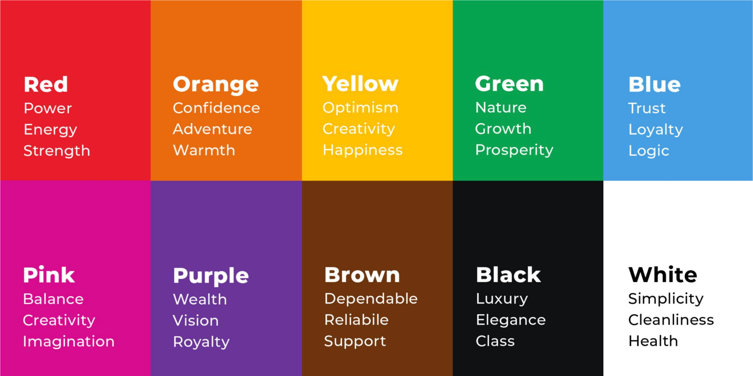
Colours have a profound effect on how things are interpreted and are important for setting a tone or mood. The expression “Beauty is in the eye of the beholder” is not strictly true. When used poorly, colours can make audience feel lost or irritated. Moreover, sufficient contrast between the colour of the background and the text are vital for being able to read the text. Additionally, appropriate use of colours can guide viewers eyes to important information. There is a science to what colours should be used together, and in general the default colour schemes from software such as word and powerpoint should not be used.
Successful companies are well aware of the power of branding. Every year billions of dollars are spent on branding and marketing of companies and products. Indeed, when companies are struggling to achieve their goals they often undergo ‘rebranding’ to aid with this, whether that be to change their logo and/or colour scheme. It could be said that all ‘successful’ companies have a name, logo or colour scheme that is instantly recognisable and memorable. For example when reading the names Google, Apple, Microsoft, or Amazon you can instantly recall the colours or logo associated with them. As well as this, they are aware that the branding they choose should be reflective of their target audience, i.e. a food company that wants to be associated with natural products may use green, where as a modern ‘science-based’ product may use blacks and whites.
Colour Terminology
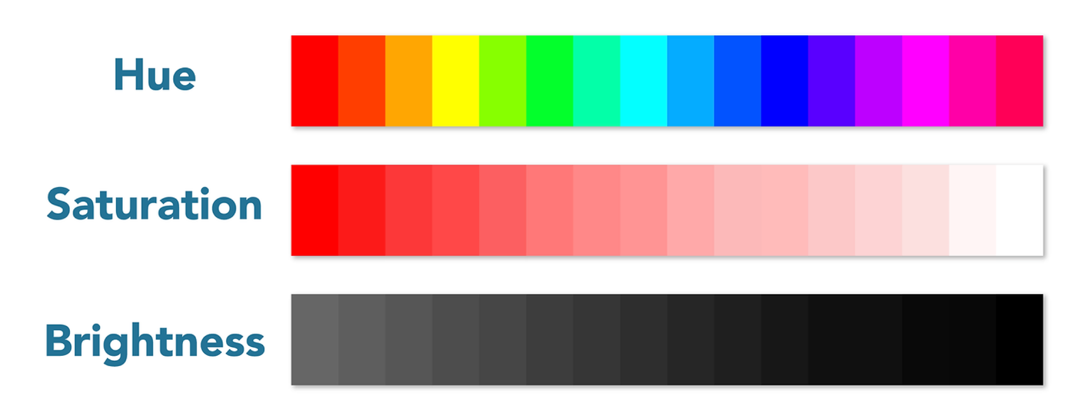
There are a few core terms used to describe a colour’s characteristics that you should be aware of.
The properties of colour that you should know are hue (colour it is), saturation (intensity of colour), brightness (how dark the colour is) and temperature.
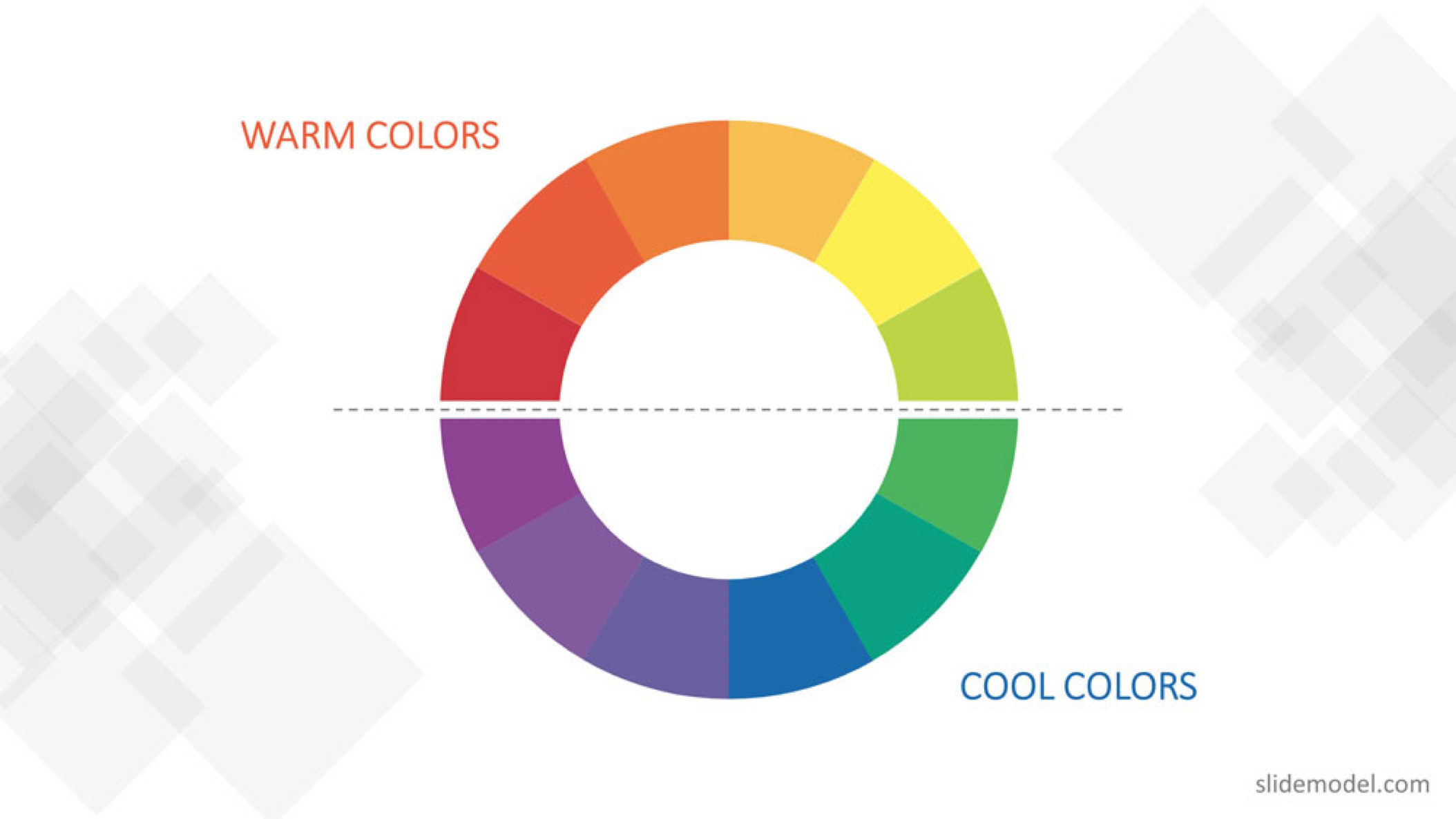
Colour Theory
To understand the basic premise of colour theory, we highly recommend reading this guide from Adobe.
“Color theory combines art and science to provide foundational guidance for mixing, replicating, and pairing colors. For years, scientists have used color wheel diagrams to illustrate the relationships between different colors.” - Adobe
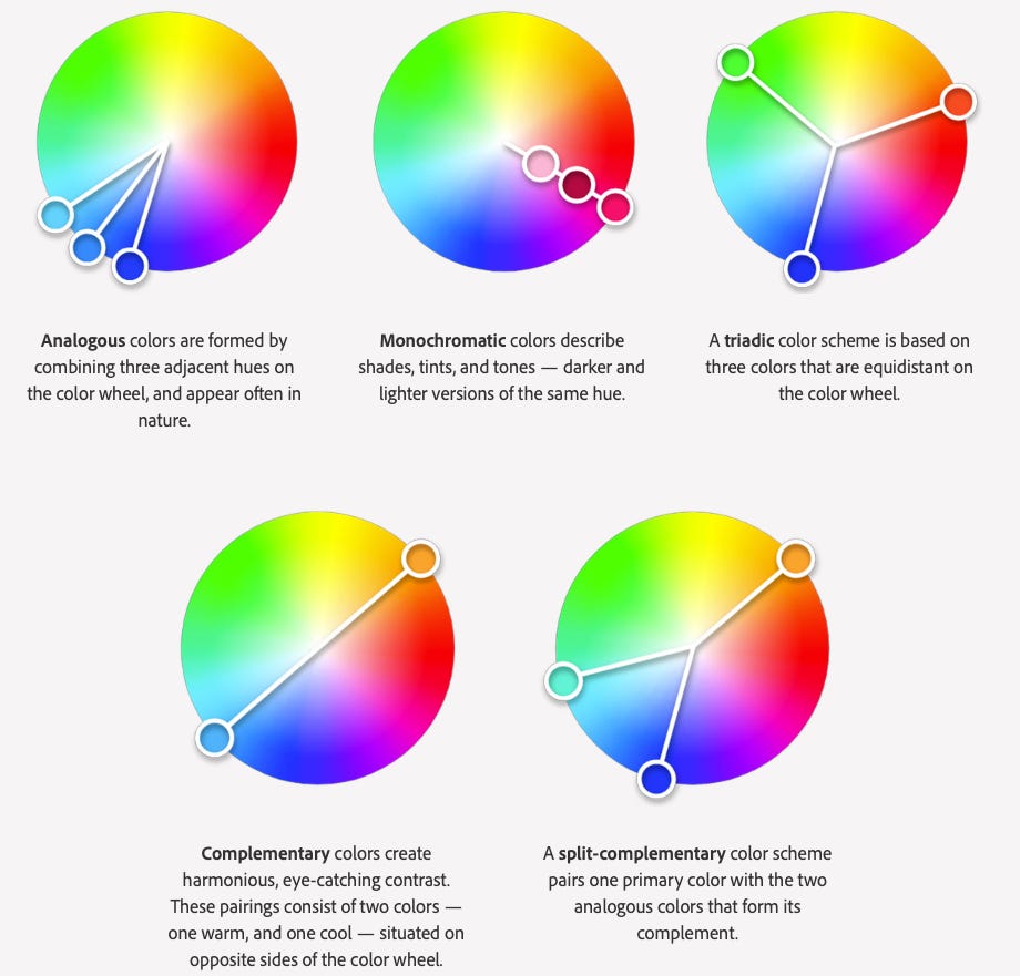
Colour Schemes
Knowledge of colour theory should then be applied at every opportunity in your work. To do so, you should use palettes or schemes that follow colour theory for slides and figures. There are many online resources such as the trends page on Adobe Color that you can use to find schemes. In general, we have found that the Graphic Design section provides the palettes with sufficient contrast for posters and presentations.
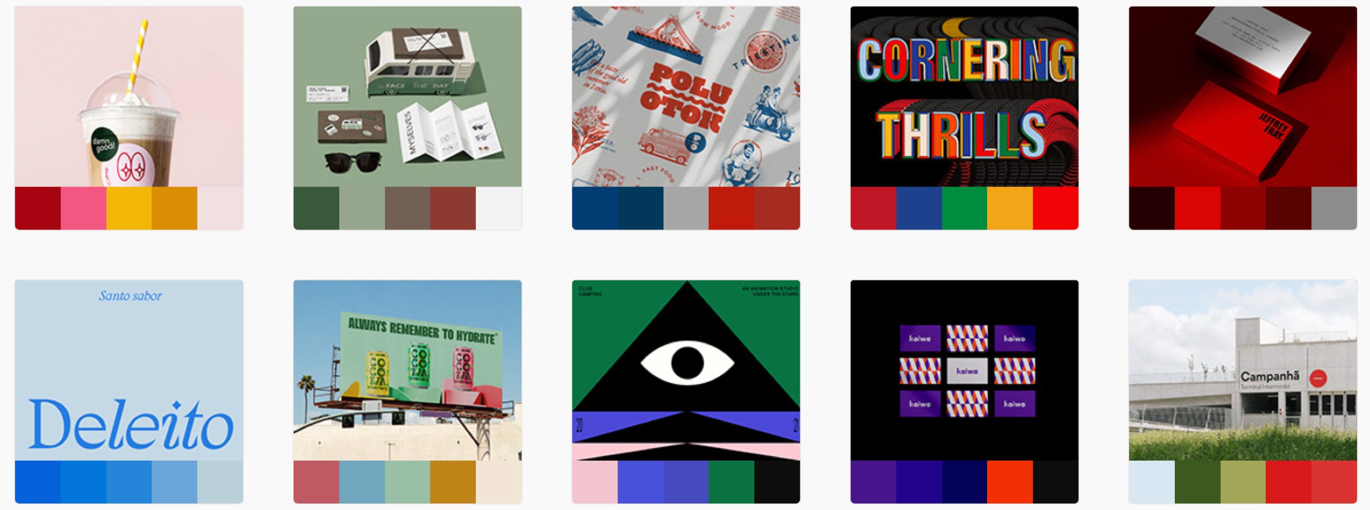
Learn from Media
If you are unsure what colour palettes to choose you can pay attention to TV shows and movies to see how specific colours are used to evoke specific emotions. This article is a shows some examples of the pallets in some famous movie scenes, such as these below:
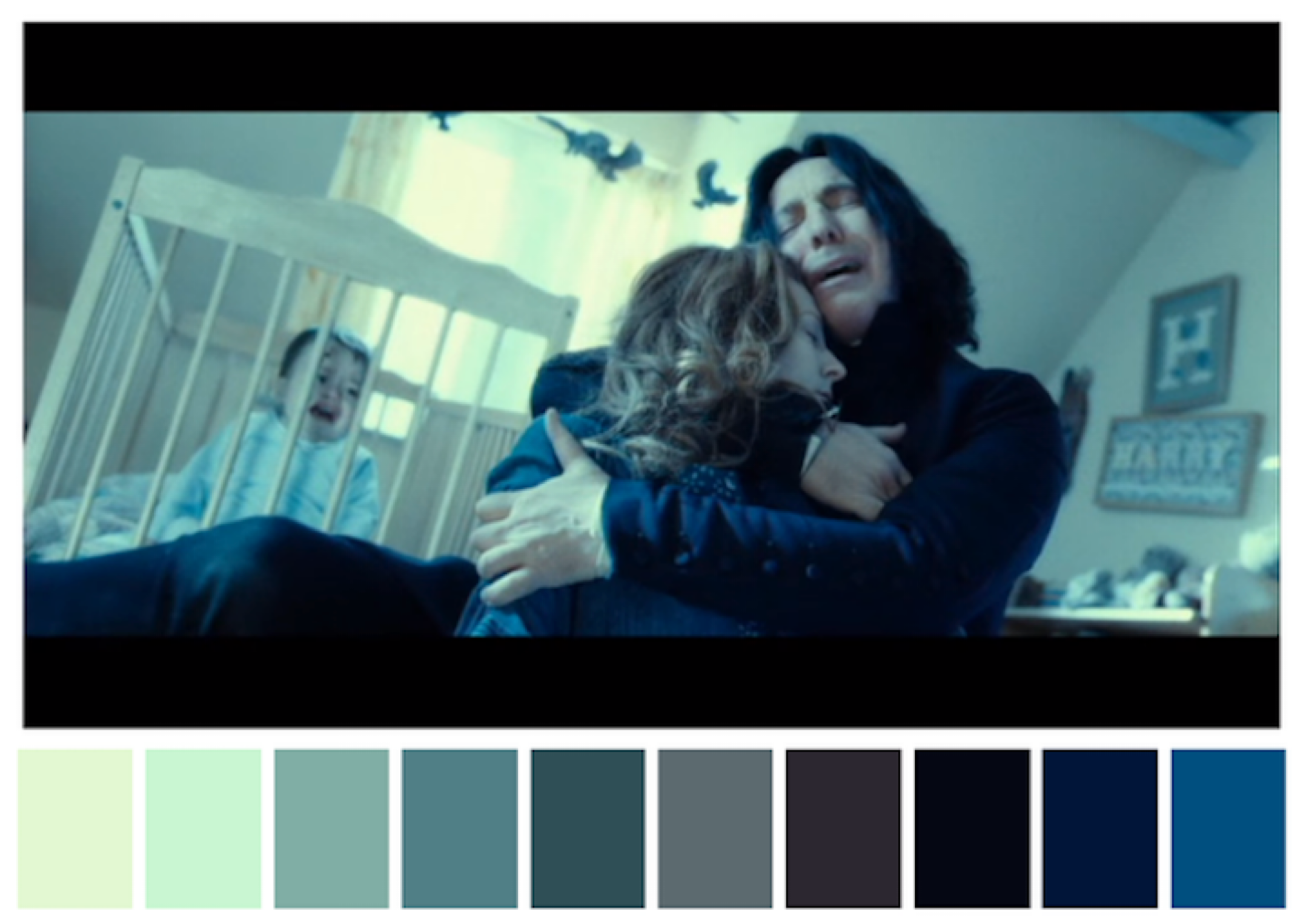
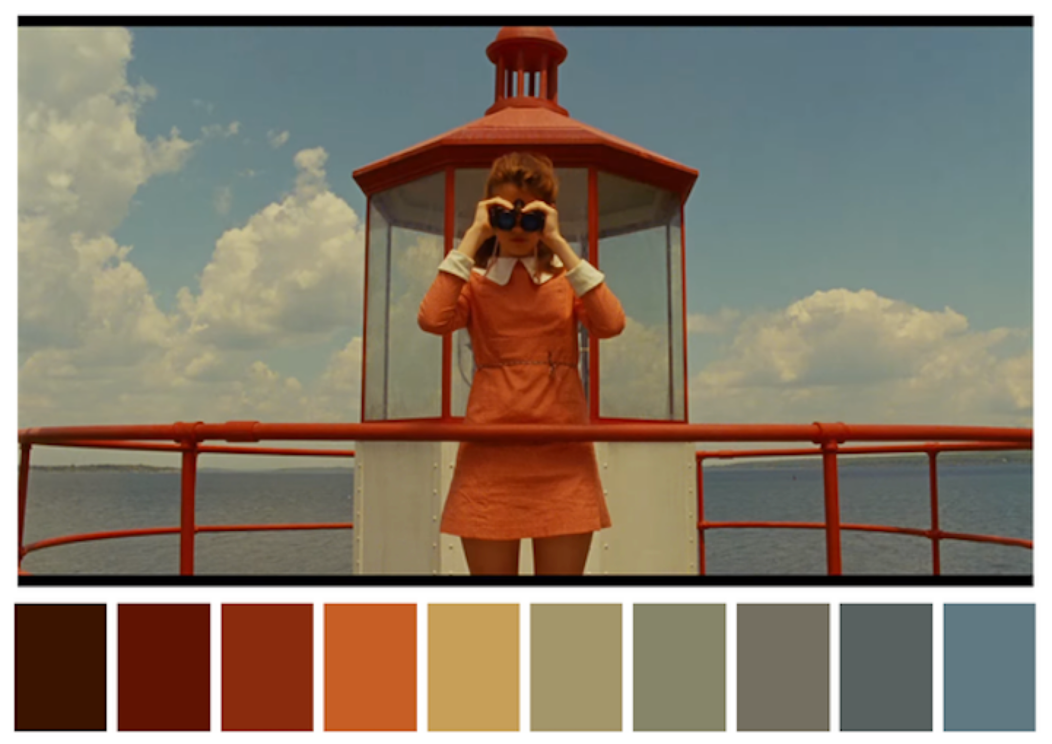
Notice the emotions provoked by looking at these pictures and you can start to get a feel of how to use them.
For more in-depth look at this in movies and art, we highly recommend watching the following videos:
Careful with Colour
The balance of colour is also important. Simple is often better as it can give a ‘clean’ and professional appearance. This is particularly the case in the sciences, in general its probably better to err on the side of clean and simple colour schemes that are not too bright.
Not only is selecting the right colours important, but it’s also important to use them in the right proportions. In general it is good to apply the 60-30-10 rule; a concept that originated from interior design.
Appropriate proportion of colours in a given space:
60%: Main colour used in background
30%: Secondary colour used for shapes and image fill
10%: Accent colour used for outlines and text
Below is an excellent example of how to apply this to a poster from animateyourscience:
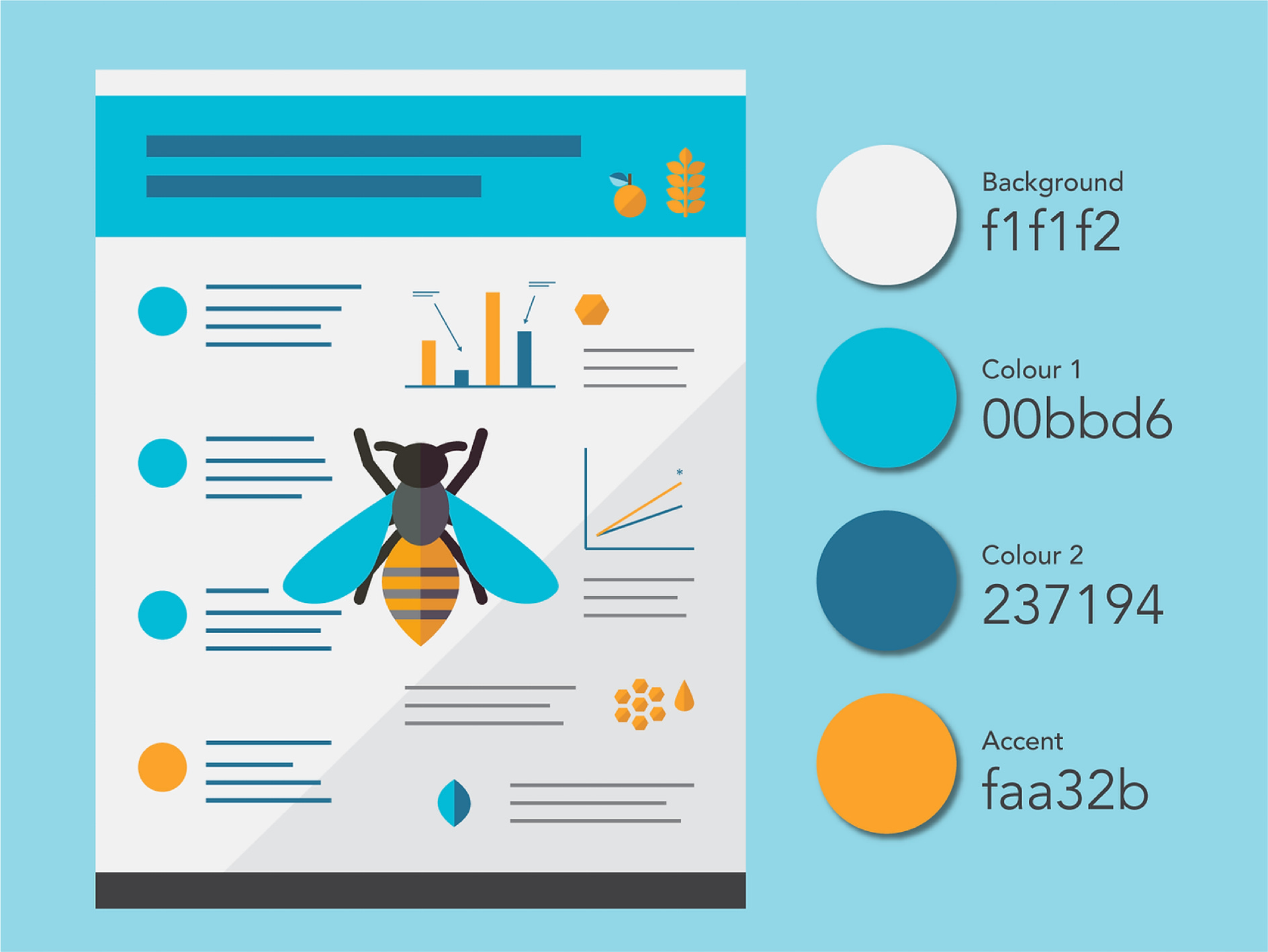
As you can see there is a distinct colour theme throughout the entire piece including the figures and the data which gives it a more professional feel.
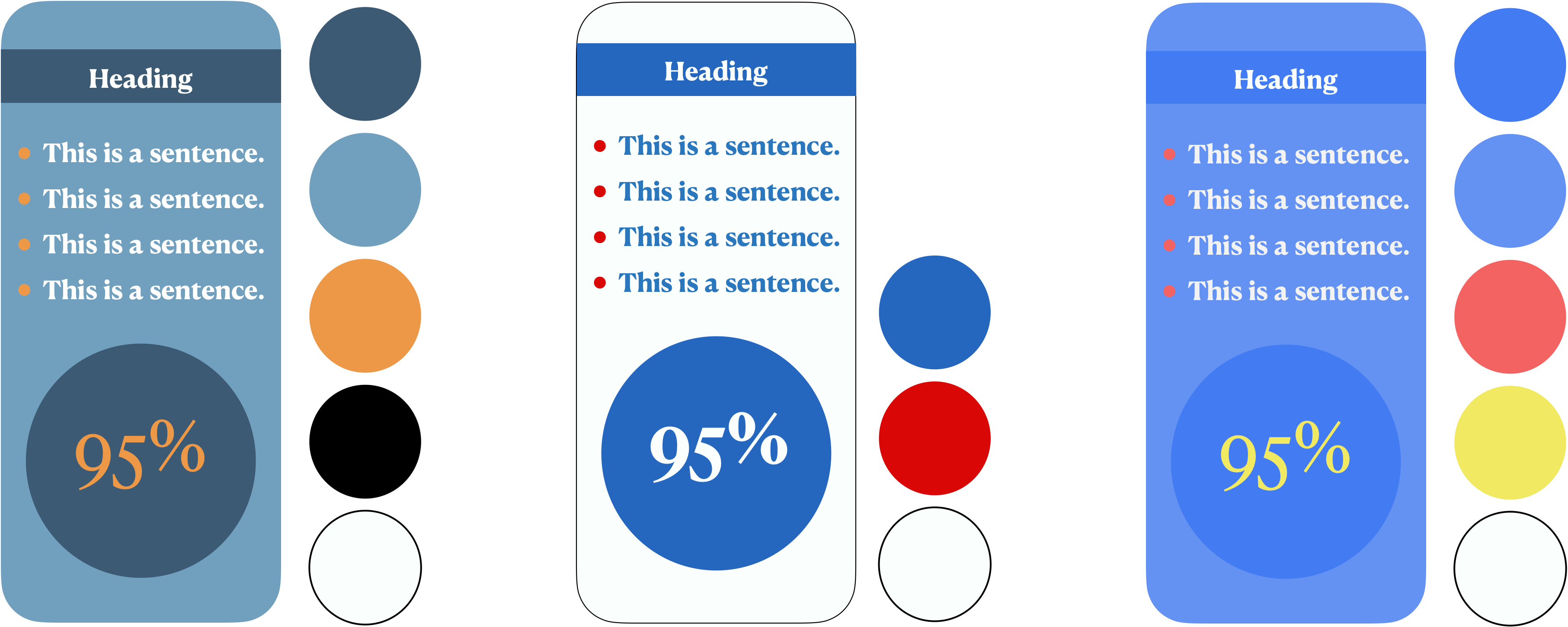
Here are some example designs we have made based on this advice:
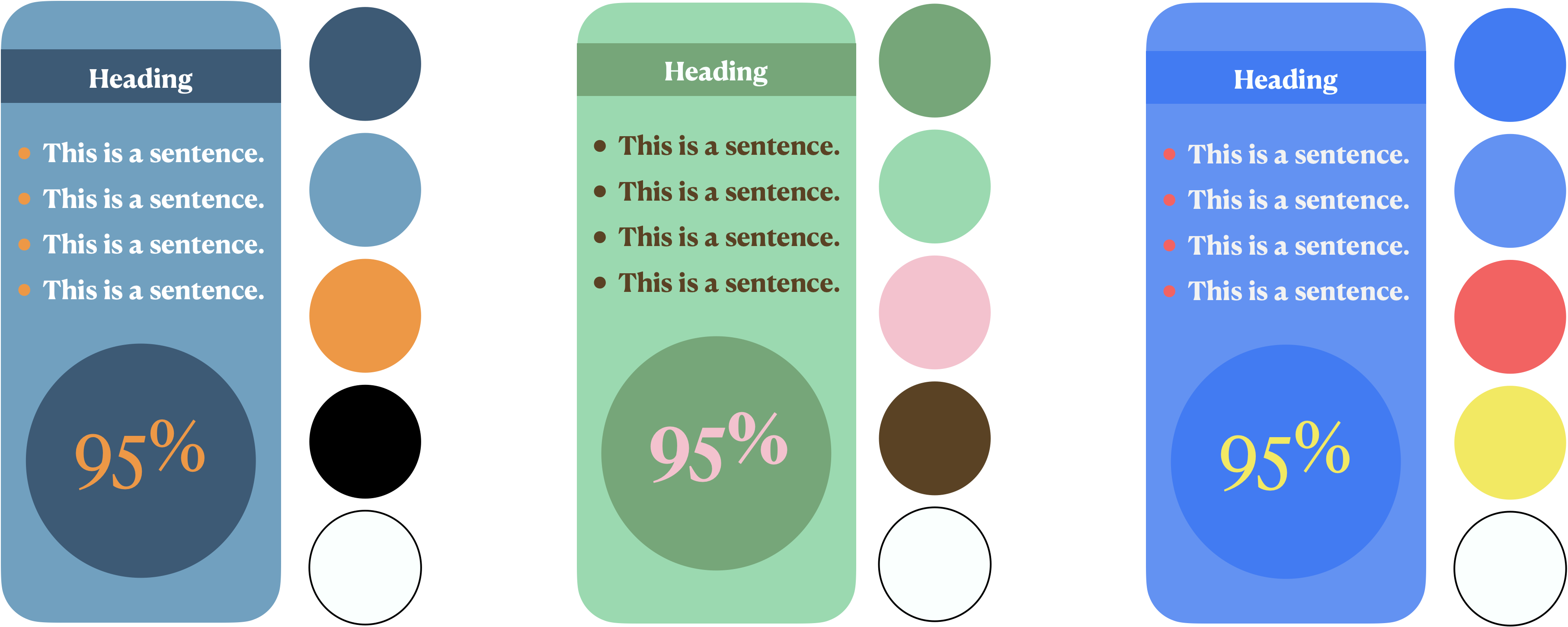
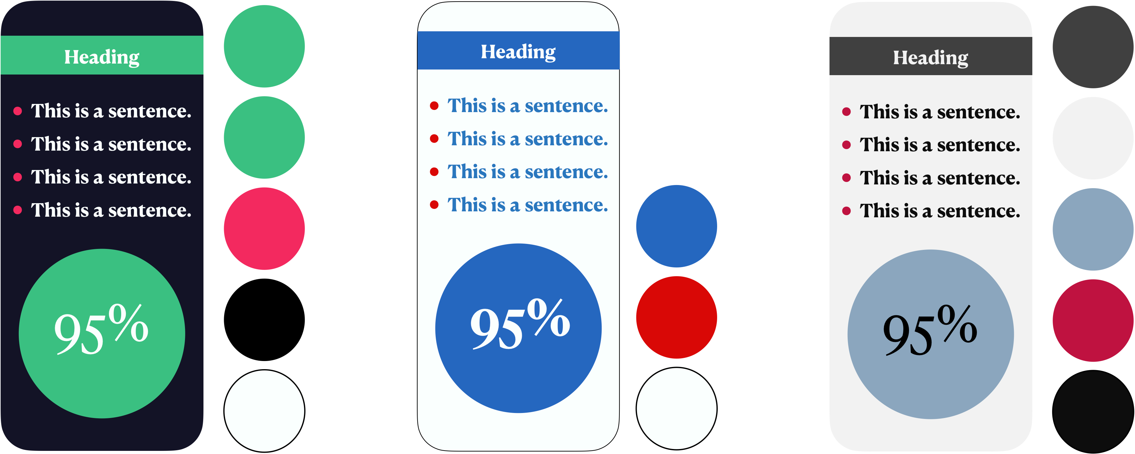
As you can see, the different colour combinations give a different ‘feel’, with some feeling more ‘professional’ than others.
You should also apply this advice to presentation slides. However, if you want your slides to stand out and be more creative you can implement icons and flowcharts. In general, including flowcharts for analytical pipelines significantly increase the intelligibility of your project. For some great examples of visually appealing slides you can take a look at slidesgo:
Displaying Data
When choosing colour schemes for your work you should take your data into consideration before making any decisions. This is because colour can improve how easily your data can be understood and interpreted. Most people already have a sense of this, for example using green for an increase and red for a decrease in something. Other than that, however, we often find it more challenging to use colours to present our data. In general, different types of colour schemes should be used for qualitative and quantitative data.
Sequential colour scheme:
Display order-able or numeric data.
Progress from low to high using colours from light to dark

Diverging schemes:
Highlight values above and below an interesting mid-point in quantitative data. In this example the midpoint is a yellow with above and below denoted by red and green.

Qualitative schemes:
Demonstrate categorical differences in qualitative data. Use different hues with consistent steps in lightness and saturation.

The information and figures used above are from carto-colours, which have an R package that you can use to apply to your data. For a comprehensive list of colour pallets in R you can check out this GitHub repo.
Familiar with Fonts
Choice of font is also incredibly important as text must be 100% readable to the target audience. Consider both the sizeand style of the font. For presentations it’s often said that you should use font no smaller than size 18. Again, most people are aware of this basic advice, but good use of multiple fonts can have a significant visual impact
Specifically, they can be used to:
Create a visual hierarchy.
Helps distinguish between headings and main text.
Highlight key information.
You should use 3 different fonts at the most.
Combine different styles that contrast and compliment each other. A common combination is Serif with Sans Serif. Serif are considered more traditional and formal that are recognised by small tails on each letter. A popular example is Times New Roman. Sans serif are more modern and perceived as informal, as they are more clean and use simple letters. A popular example is Helvetica.
An excellent example of this can be observed on a guide from slidesgo; the origin of the examples below:
Combination of Colours and Fonts
To create great posters and presentations, you should combine your knowledge of both colours and fonts. Appropriate use of both colour schemes and fonts will drastically improve aesthetics.
Additionally, you can incorporate colour scheme into font use. For example, you can use different fonts and colours for:
Headings and subheadings
Main body
Extra information (e.g. quotes)
By doing so, it will allow your work to be understood and enjoyed more easily. Moreover, it will give a sense of professionalism derived from a strong sense of identity and unity across your work. This is similar in concept to branding that was mentioned above.
To demonstrate how effective this can be when used together consider the previously shown mock posters in comparison to ones that utilise more than 1 font:
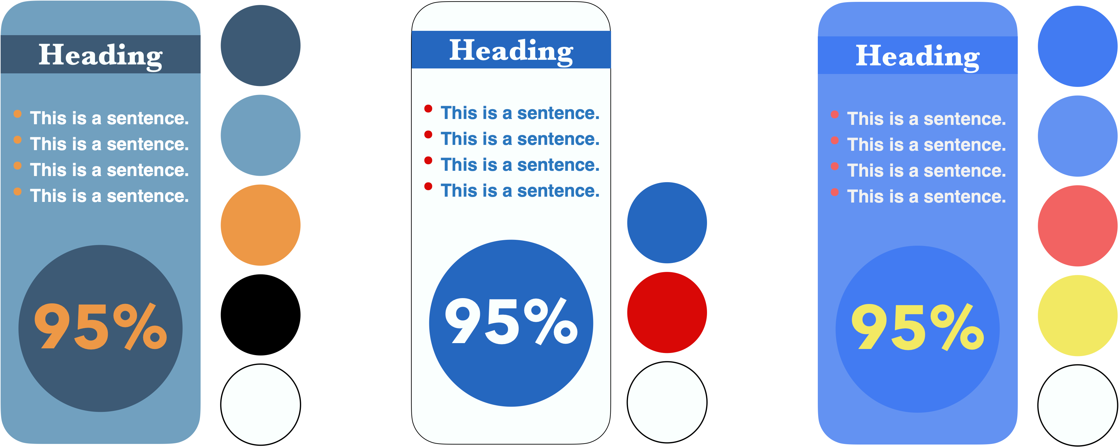
You can see that the heading and body font being different causes a visual hierarchy, and that the numbers in the circle are more appealing and legible than in the previous version.
Conclusion
Communication of science needs to be engaging to be successful. The quality of your work is often represented by how well you can present it. This requires the combination of multiple skills to create an aesthetically pleasing and compelling piece of work. It is important to pay careful attention to detail to ensure consistency.
The main areas to consider when producing a piece of work are:
Storytelling
Colour palettes
Typography
Eloquence and fluency of language
References
https://meandyou.co.uk/3-reasons-why-colour-is-so-important-for-your-brand/
https://www.animateyour.science/post/how-to-select-a-great-colour-scheme-for-your-scientific-poster
https://creativecloud.adobe.com/cc/discover/article/understanding-color-a-visual-guide
https://slidemodel.com/choose-color-scheme-powerpoint-presentation/
https://mymodernmet.com/cinema-palettes/